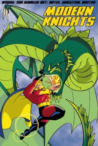
 After a bit of a break, I’ve come back to the book again and spent a little time looking at alternative faces for the previously mentioned Blambot choice, Wicked Queen. I went back and looked at another Comics inspired fontmaker, Iconian Fonts to see if I could find something that suited. To the left you’ll see my experiments with Powerlord.
I like what I ended up with, but again found a two layer OSS fail here. GIMP ( 2.6 and 2.7 at this time ) do not support hand kerning, linespacing, etc. Okay. I can work around that. Bring in Inkscape. I was able to lay out the lettering to my liking there. Import the SVG back into Gimp and bam! Kerning is gone. To get what we see there I had to export a PNG, which is far from perfect. I suspect I’m going to have to do this in Scribus as well, once I get a mockup I like.
This leads me to my second WTF. I’ve been working through a dossier mockup for the saple characters, something I hope will end up being a little nicer than a columner data dump as I did in the last version. Still using Powerlord for my labels, I get a good way through and decide to see how it looks on my Nook. Dump to PDF and what do I find? Several letters show up wrong. Lower case G’s show as C’s, for example. Evince and KPDF both show the same thing. Import it into Gimp and it’s alphabet soup. Pull it onto the Nook and it’s correct. Now the Nook is running an Acrobat derived reader rather than an OSS engine, so that might mean that the back end parsers are to blame, not Scribus. I’m dubious.
More time in Mantis, I guess.
Leave a Reply